Election result maps
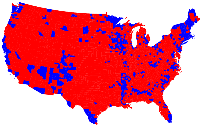
This page shows the standard electoral result maps that we all saw on the networks, but then goes on to show them in several different and more enlightening ways - showing them as 'catrgograms' for example, with the states sized by raw population, or sized by the number of electoral votes. The one most interesting to me, though, was the picture with the results by county, showing whether a county went for Kerry or Bush. Look near the center of Texas. See that one blue county in the sea of red? That is Austin, and that is why I would probably never live anywhere else in Texas. Well, there are those counties down in South Texas, but I don't think I'm moving down there. One thing to note - this map seems like a sea of red - but make sure to look at the same map as a cartogram, which sizes each county by population. Then you get a more accurate picture that shows (as the numbers do) that 48% of the country went for Kerry, and 51% for Bush.
 Another good map, which shows results by county, shaded in degress of purple.
]]>
11/16/2004 08:54:38 AM
approved
Steve
false
false
Another good map, which shows results by county, shaded in degress of purple.
]]>
11/16/2004 08:54:38 AM
approved
Steve
false
false